Friday, 11 December 2009
Evaluation
Media Evaluation
In what ways does your media product use, develop or challenge forms and conventions of real media products?
The way in which our media product uses similar conventions of a real media product is by sticking to same the conventions of media products in the past. We based our ideas around Goodwin’s Music Video Analysis to get a foundation and a starting point for our project, this included us looking at music videos to see in what genre style we would want to portray out video. Andrew Goodwin said that music videos should demonstrate genre characteristics and the is a relationships between both lyrics, music and visuals, those are two of his six points to successfully evaluate music videos. (“Dancing in the distraction factory” Routledge 1992). We also looked at the lyrics of the song as we found them to have quite a clear story in them, for example we looked at Just Jacks video ‘the day I died’ as in the video the actor follows exactly what the lyrics our saying and that is something we wanted to incorporate in our videos. Another video that also helped us greatly was Vanessa Carlton-One thousand miles as it constantly follows the lead singer and this is something we wanted to do in out video.
Forms of real media that we used were for the digipak and cd cover were the bar codes and the real record labels we did this to add professionalism to our work. Using quotes from other magazine’s and companies also added the same effect as the logos. These means the consumer can feel comfortable when purchasing the product as they have well branded names to consolidate in.
Our video used convention types with that balanced black and white and colour effectively. We wanted to make the main singer in black white as to show the sadness and loneliness of the lyrics, inspiration of this came from the music video ‘We Cry’ by The script. Another convention used was taking the idea from the clip from the Austin Powers movie where Elvis Costello is singing in the street and has his drummer in the street to. We felt even though it was a similar convention it was also changeling convention types as it is still quite an original idea.
A way in which we changed conventions was by incorporating a few different genre types into our video. We decided to make it a sad video but the song itself is still rather upbeat this meant we could take a classic pop feel mixed in with an indie look with the drummer playing on the street. Even though we used mainly one shot type from a front on position this was done purposely as to show the solitude and sadness of the lead singer, though we did use different shots such as capturing the lead singer in a reflection. I feel if
We had more time to film the video we could of collaborated more different shot types and more shots of the band and maybe adding some more instruments. This could of made the front on shots of the lead singer stand out more.
How effective is the combination of your main product and ancillary texts?
The combination of our main product and the ancillary texts I have found to be very good as we kept our ideas form a video to our ancillary texts consistant. This was done by incorporating the black and white from music video to our digipak and cd cover by having a black background and white writing. We used screen grabs from our video and put them into our ancillary texts, we did this as we thought the potential consumer would be able to see characteristics in both areas and would persuade them more to buy the product. By keeping the ancillary texts dark and black it kept in line with the message we were trying to portray from a music video of a sad, lonely and vulnerable character thus is why we choose that particular image for our cd cover. The reason for choosing the text that we did was to keep in style with the dark theme and it is rather indie looking and this is one of the genre styles we were trying to show so this worked well of both aspects. To gain ideas for the magainze advert we researched professional examples to give us a firm understanding of what to do, we kept contuintiy with the colour scheme with the writing and used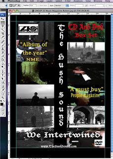 the same record label to reassure the purchaser. We found with our main shot for the cd cover that to have the city in the background almost consuming the lead singer was effective as that was the idea for our video and this could be shown in the cd cover as well.
What have you learnt from your audience feedback?
What we established from out audience feedback was a variety of different views not just on the video but on the ancillary texts as well. Our overall feedback on our video was very positive as the audience liked the fact you were following the lead singer through his life and emotions. This was something we were proud of as it was what we were trying to achieve from the start of out project. Our main critics tended to say that was not enough variety with out shot types, this is something we new already but our thoughts were reaffirmed with the feedback. This is something that would of liked to change but not having enough different shot types it was a group decision to over do the front on shot purposely as to show the lead singers feelings and emotions. We also received some constructive criticisms mid way through our project which told us that parts of our video did not match the flow and pace of the song, this helped us greatly as it meant we could change this and get some extra footage to counteract this dilemma. Another point that was made through feedback was that some of out zooming in wasn’t that straight and if we had the time this is something we would of gone back and redone. One of the main things that we received positive feedback for was the use of black and white for the lead singer, the audience appeared to like this as it added a different dimension to out video rather than just having the whole thing in colour.
For our ancillary texts the majority of the audience feedback was very positive. This was mainly because of the strong continuity between our video and between both the magazine advert and the cd cover. We found the audience liked the fact there were screen grabs from our music video in our ancillary text. The audience liked the fact that we kept the black and white theme in our ancillary text as this was a firm link to keep all aspect of the project together. This was aesthetically pleasing for us as it made us realise that the audience could recognise all of our products together. One of the more subtle things we got feedback from was that in our music video every time an instrumental moment was show it was in colour and we kept this the same for our magazine advert and out cd cover. Something we did receive a slight bit of negative feedback on was our text and that with the dark background it made the feel of our ancillary texts look to gothic, this is something the audience did not wish to see as this was still a pop music video and ancillary texts and even though it is a sad album it did not quite fit in with our final idea. As a group we overall perceived our final audience feedback to be very positive and that we had achieved we wanted to from the start of the project.
How did you use new media technologies in the construction and research, planning and evaluation stages?
For our construction, research, planning and evaluation stages we used many different sources of media technologies. For the research stage of this project we mainly used the internet as our main source of topic knowledge. We used websites such as youtube to find music videos and styles which wanted to base our idea around. Many videos were used as inspiration to our group from such diversities as Elvis Costello to the Arctic Monkeys I believe this to be a good thing as it meant we could put a lot of different ideas into our project. Google was also used to find different art work of bands albums and magazine adverts to give us a base for our ancillary texts. The research stage to our project I think was one of the key parts to this project as it gave us a firm foundation to continue with.
The planning stage of this project soar our group use different media technologies. With the bases of the planning we had our initial ideas ready. The group planned by story boarding our ideas in which we took pictures of this and put them onto the blog. The blog was used as our main area of planning as it aloud us to put all of our ideas down weather good or bad. All of our planning and research went onto the blog. Blogging also helped us as a group stay in contact with each if someone was ill or needed to find out information. By having the information on the blog it meant when we got to the filming stage of the project it meant we had a source to go to if we forgot any ideas. For our planning we also used Google maps as to find the best play to film our project and to help each other with directions to getting to filming location.
The media technologies we used for the construction stage was the main part to our project, We used final cut for the editing side of video which was extremely effective to make our video look a lot better. We change the lead singers part to black and white which made the overall impression of the video a lot professional. Photoshop was used to create our ancillary texts, this helped as it enabled us to make our magazine advert and cd cover collaborate with our music video. We did use final cut to make the ancillary texts as this as took screen grabs from a video and imported them into photoshop. We also used video cameras and a still imagine camera to make our music video.
For the evaluation stage of our project the main use of media technology was the blog. This was because our audience could post anything they felt about project on there and it has enabled us to put down our own evaluation on there. Also for the evaluation stage we used the video camera to record our documentary of our evaluation. We used final cut to edit this which was difficult as we spoke so much about the project and we had to fit all our information into a short space of time. For the final question of the recorded evaluation we used images from the internet and the blog and final cut which we took a screen shot to enabled us to import them into final cut.
In what ways does your media product use, develop or challenge forms and conventions of real media products?
The way in which our media product uses similar conventions of a real media product is by sticking to same the conventions of media products in the past. We based our ideas around Goodwin’s Music Video Analysis to get a foundation and a starting point for our project, this included us looking at music videos to see in what genre style we would want to portray out video. Andrew Goodwin said that music videos should demonstrate genre characteristics and the is a relationships between both lyrics, music and visuals, those are two of his six points to successfully evaluate music videos. (“Dancing in the distraction factory” Routledge 1992). We also looked at the lyrics of the song as we found them to have quite a clear story in them, for example we looked at Just Jacks video ‘the day I died’ as in the video the actor follows exactly what the lyrics our saying and that is something we wanted to incorporate in our videos. Another video that also helped us greatly was Vanessa Carlton-One thousand miles as it constantly follows the lead singer and this is something we wanted to do in out video.
Forms of real media that we used were for the digipak and cd cover were the bar codes and the real record labels we did this to add professionalism to our work. Using quotes from other magazine’s and companies also added the same effect as the logos. These means the consumer can feel comfortable when purchasing the product as they have well branded names to consolidate in.
Our video used convention types with that balanced black and white and colour effectively. We wanted to make the main singer in black white as to show the sadness and loneliness of the lyrics, inspiration of this came from the music video ‘We Cry’ by The script. Another convention used was taking the idea from the clip from the Austin Powers movie where Elvis Costello is singing in the street and has his drummer in the street to. We felt even though it was a similar convention it was also changeling convention types as it is still quite an original idea.
A way in which we changed conventions was by incorporating a few different genre types into our video. We decided to make it a sad video but the song itself is still rather upbeat this meant we could take a classic pop feel mixed in with an indie look with the drummer playing on the street. Even though we used mainly one shot type from a front on position this was done purposely as to show the solitude and sadness of the lead singer, though we did use different shots such as capturing the lead singer in a reflection. I feel if
We had more time to film the video we could of collaborated more different shot types and more shots of the band and maybe adding some more instruments. This could of made the front on shots of the lead singer stand out more.
How effective is the combination of your main product and ancillary texts?
The combination of our main product and the ancillary texts I have found to be very good as we kept our ideas form a video to our ancillary texts consistant. This was done by incorporating the black and white from music video to our digipak and cd cover by having a black background and white writing. We used screen grabs from our video and put them into our ancillary texts, we did this as we thought the potential consumer would be able to see characteristics in both areas and would persuade them more to buy the product. By keeping the ancillary texts dark and black it kept in line with the message we were trying to portray from a music video of a sad, lonely and vulnerable character thus is why we choose that particular image for our cd cover. The reason for choosing the text that we did was to keep in style with the dark theme and it is rather indie looking and this is one of the genre styles we were trying to show so this worked well of both aspects. To gain ideas for the magainze advert we researched professional examples to give us a firm understanding of what to do, we kept contuintiy with the colour scheme with the writing and used
 the same record label to reassure the purchaser. We found with our main shot for the cd cover that to have the city in the background almost consuming the lead singer was effective as that was the idea for our video and this could be shown in the cd cover as well.
What have you learnt from your audience feedback?
What we established from out audience feedback was a variety of different views not just on the video but on the ancillary texts as well. Our overall feedback on our video was very positive as the audience liked the fact you were following the lead singer through his life and emotions. This was something we were proud of as it was what we were trying to achieve from the start of out project. Our main critics tended to say that was not enough variety with out shot types, this is something we new already but our thoughts were reaffirmed with the feedback. This is something that would of liked to change but not having enough different shot types it was a group decision to over do the front on shot purposely as to show the lead singers feelings and emotions. We also received some constructive criticisms mid way through our project which told us that parts of our video did not match the flow and pace of the song, this helped us greatly as it meant we could change this and get some extra footage to counteract this dilemma. Another point that was made through feedback was that some of out zooming in wasn’t that straight and if we had the time this is something we would of gone back and redone. One of the main things that we received positive feedback for was the use of black and white for the lead singer, the audience appeared to like this as it added a different dimension to out video rather than just having the whole thing in colour.
For our ancillary texts the majority of the audience feedback was very positive. This was mainly because of the strong continuity between our video and between both the magazine advert and the cd cover. We found the audience liked the fact there were screen grabs from our music video in our ancillary text. The audience liked the fact that we kept the black and white theme in our ancillary text as this was a firm link to keep all aspect of the project together. This was aesthetically pleasing for us as it made us realise that the audience could recognise all of our products together. One of the more subtle things we got feedback from was that in our music video every time an instrumental moment was show it was in colour and we kept this the same for our magazine advert and out cd cover. Something we did receive a slight bit of negative feedback on was our text and that with the dark background it made the feel of our ancillary texts look to gothic, this is something the audience did not wish to see as this was still a pop music video and ancillary texts and even though it is a sad album it did not quite fit in with our final idea. As a group we overall perceived our final audience feedback to be very positive and that we had achieved we wanted to from the start of the project.
How did you use new media technologies in the construction and research, planning and evaluation stages?
For our construction, research, planning and evaluation stages we used many different sources of media technologies. For the research stage of this project we mainly used the internet as our main source of topic knowledge. We used websites such as youtube to find music videos and styles which wanted to base our idea around. Many videos were used as inspiration to our group from such diversities as Elvis Costello to the Arctic Monkeys I believe this to be a good thing as it meant we could put a lot of different ideas into our project. Google was also used to find different art work of bands albums and magazine adverts to give us a base for our ancillary texts. The research stage to our project I think was one of the key parts to this project as it gave us a firm foundation to continue with.
The planning stage of this project soar our group use different media technologies. With the bases of the planning we had our initial ideas ready. The group planned by story boarding our ideas in which we took pictures of this and put them onto the blog. The blog was used as our main area of planning as it aloud us to put all of our ideas down weather good or bad. All of our planning and research went onto the blog. Blogging also helped us as a group stay in contact with each if someone was ill or needed to find out information. By having the information on the blog it meant when we got to the filming stage of the project it meant we had a source to go to if we forgot any ideas. For our planning we also used Google maps as to find the best play to film our project and to help each other with directions to getting to filming location.
The media technologies we used for the construction stage was the main part to our project, We used final cut for the editing side of video which was extremely effective to make our video look a lot better. We change the lead singers part to black and white which made the overall impression of the video a lot professional. Photoshop was used to create our ancillary texts, this helped as it enabled us to make our magazine advert and cd cover collaborate with our music video. We did use final cut to make the ancillary texts as this as took screen grabs from a video and imported them into photoshop. We also used video cameras and a still imagine camera to make our music video.
For the evaluation stage of our project the main use of
media technology was the blog. This was because our audience could post anything they felt about project on there and it has enabled us to put down our own evaluation on there. Also for the evaluation stage we used the video camera to record our documentary of our evaluation. We used final cut to edit this which was difficult as we spoke so much about the project and we had to fit all our information into a short space of time. For the final question of the recorded evaluation we used images from the internet and the blog and final cut which we took a screen shot to enabled us to import them into final cut.Individual evaluation
Music video evaluation
1. In what ways does your media product use, develop or challenge forms and conventions of real media products?
Our music video follows many conventions of the rock music genre, it incorporates many sections of performance from the band themselves and from the lead singer. We developed these conventions, usually the band is all together performing as a group however we only pictured the individuals by themselves performing separately, although we weren’t originally aiming for this it did give an extra sense of separation and isolation in the video making the lead singer seem even more lonely. Our style of video was fairly similar to the verve’s- bittersweet symphony, with lots a lot of close up front on shots of the lead singer performing through the streets. Our colour scheme was also very similar to this video’s as they chose a very dull and emotional colour scheme. I like the blue effect that they have done with this video and I think that maybe with more time we could have done something like this to more sections of our video, rather than just the guitar solo section where we added a green tint to the video. If we had more time we could of done some group performance, if we had done this without including the lead singer this would have enhanced the main singers solitude in the video. We took a lot of inspiration from some videos one video was ‘thousand miles’ by Vanessa Carlton, which gave us inspiration for the piano close ups, as well as following the main singer throughout the video. We also took inspiration from an Elvis Costello song from an Austin powers movie, this gave us the idea for putting the drumkit in the street as though it’s an everyday happening.
2. How effective is the combination of your main product and ancillary texts?
The combination of our main product and ancillary texts has been very effective, they include a lot of screen grabs from our media product promoting the video and the singer, and also giving the viewer a slight insight to what the product includes without giving away too much. The ancillary products also carried through the dark dingy style of our video, giving the effect that the bands style of music is quite sad and lonely The reason we chose the shot we did for the main cover of the digipack was to encapsulate the relationship between the city and the lead singer in one shot. The colour scheme we chose was black and white this was because the song is fairly dull and sad. We felt that a black and white colour scheme would enhance the emotion of the magazine advert and digipack aswell as create a relationship between our main media product and our ancillary texts. We thought that the song had a rock feel to it and this would be shown with ease through the text that we chose. We chose a fairly gothic style of text to elaborate on this and we kept the continuity through our ancillary texts by using this text style throughout. This allowed the viewer to gain some idea of what the music genre is before listening to the song. We constructed our magazine advert and digipack the way we did after researching professional magazine adverts and digipack’s, we felt that we layout we chose would get all the information we needed to get to the audience in the cleanest format, such as the bands name and pictures of the band.

3. What have you learnt from your audience feedback?
The feedback we have received about our products has been really constructive, the audience feels that our ancillary texts match the style of our video well and the products compliment each other, there was a mixed opinion on our text choice for the ancillary products, some of our audience felt it was a bit gothic whereas others felt it enhanced the product. Although it was a fairly gothic style of text we feel it suits the style of our band, as it makes them look slightly more rock. We also received feedback about half way through the creation of our main product on piece of feedback we received was about the length of the clips towards the end of the video, the audience felt that they were off the pace of he song, to counteract this went out and did some more filming and captured more shots and edited the clips in making the pace of the video faster and more interesting, this received positive feedback after we had made these changes. If we were given more time for our media product we would of re-shot some of the scenes again such as when the lead singer is pictured on a bench, and we zoom out to reveal the drummer, this could be improved because the zoom out is not as smooth as we would have liked, it has a few jolts which spoils the running of the video. The feedback we have received has been extremely important because it has helped us to improve areas of our products that we have not realised needed improving and has helped us provide the audience with what they want.
4. How did you use new media technology in the construction, research, planning and evaluation stages?
We used various mew media technology, in our research, planning, construction and evaluation stages. We did a lot of blogging to help us with our planning stages, to create what appears as almost a timeline showing how our product developed through all the stages of its creation. We used the internet for our research frequently as this allowed us to view other music videos and view other media products with ease, and review them using techniques such as Goodwins music video analysis. During the construction of our products we used final cut and Photoshop a lot, these were the perfect tools to organise and fit together all of our raw materials for our media product and ancillary texts as well as edit and cut shots to make the video flow with the music. The programmes we used are readily available to almost anybody with access to the Internet as you can download Photoshop and final cut. This means anybody has the means to make a music video. I feel that we used all our media technology very well we managed to edit our video with a lot of different styles and techniques, which had an effective result. Also the use of Photoshop for our magazine ad and digipack turned out looking professional and believable as we had managed to import lots of screen grabs from our main product via final cut into PhotoShop and merge them well with text. If we were to improve our use of one of the programmes we used it would be the blog. I feel we could have added more research such as pictures and other media relations, which could have improved our knowledge and understanding of music videos on the whole.
1. In what ways does your media product use, develop or challenge forms and conventions of real media products?

Our music video follows many conventions of the rock music genre, it incorporates many sections of performance from the band themselves and from the lead singer. We developed these conventions, usually the band is all together performing as a group however we only pictured the individuals by themselves performing separately, although we weren’t originally aiming for this it did give an extra sense of separation and isolation in the video making the lead singer seem even more lonely. Our style of video was fairly similar to the verve’s- bittersweet symphony, with lots a lot of close up front on shots of the lead singer performing through the streets. Our colour scheme was also very similar to this video’s as they chose a very dull and emotional colour scheme. I like the blue effect that they have done with this video and I think that maybe with more time we could have done something like this to more sections of our video, rather than just the guitar solo section where we added a green tint to the video. If we had more time we could of done some group performance, if we had done this without including the lead singer this would have enhanced the main singers solitude in the video. We took a lot of inspiration from some videos one video was ‘thousand miles’ by Vanessa Carlton, which gave us inspiration for the piano close ups, as well as following the main singer throughout the video. We also took inspiration from an Elvis Costello song from an Austin powers movie, this gave us the idea for putting the drumkit in the street as though it’s an everyday happening.
2. How effective is the combination of your main product and ancillary texts?

The combination of our main product and ancillary texts has been very effective, they include a lot of screen grabs from our media product promoting the video and the singer, and also giving the viewer a slight insight to what the product includes without giving away too much. The ancillary products also carried through the dark dingy style of our video, giving the effect that the bands style of music is quite sad and lonely The reason we chose the shot we did for the main cover of the digipack was to encapsulate the relationship between the city and the lead singer in one shot. The colour scheme we chose was black and white this was because the song is fairly dull and sad. We felt that a black and white colour scheme would enhance the emotion of the magazine advert and digipack aswell as create a relationship between our main media product and our ancillary texts. We thought that the song had a rock feel to it and this would be shown with ease through the text that we chose. We chose a fairly gothic style of text to elaborate on this and we kept the continuity through our ancillary texts by using this text style throughout. This allowed the viewer to gain some idea of what the music genre is before listening to the song. We constructed our magazine advert and digipack the way we did after researching professional magazine adverts and digipack’s, we felt that we layout we chose would get all the information we needed to get to the audience in the cleanest format, such as the bands name and pictures of the band.

3. What have you learnt from your audience feedback?
The feedback we have received about our products has been really constructive, the audience feels that our ancillary texts match the style of our video well and the products compliment each other, there was a mixed opinion on our text choice for the ancillary products, some of our audience felt it was a bit gothic whereas others felt it enhanced the product. Although it was a fairly gothic style of text we feel it suits the style of our band, as it makes them look slightly more rock. We also received feedback about half way through the creation of our main product on piece of feedback we received was about the length of the clips towards the end of the video, the audience felt that they were off the pace of he song, to counteract this went out and did some more filming and captured more shots and edited the clips in making the pace of the video faster and more interesting, this received positive feedback after we had made these changes. If we were given more time for our media product we would of re-shot some of the scenes again such as when the lead singer is pictured on a bench, and we zoom out to reveal the drummer, this could be improved because the zoom out is not as smooth as we would have liked, it has a few jolts which spoils the running of the video. The feedback we have received has been extremely important because it has helped us to improve areas of our products that we have not realised needed improving and has helped us provide the audience with what they want.
4. How did you use new media technology in the construction, research, planning and evaluation stages?

We used various mew media technology, in our research, planning, construction and evaluation stages. We did a lot of blogging to help us with our planning stages, to create what appears as almost a timeline showing how our product developed through all the stages of its creation. We used the internet for our research frequently as this allowed us to view other music videos and view other media products with ease, and review them using techniques such as Goodwins music video analysis. During the construction of our products we used final cut and Photoshop a lot, these were the perfect tools to organise and fit together all of our raw materials for our media product and ancillary texts as well as edit and cut shots to make the video flow with the music. The programmes we used are readily available to almost anybody with access to the Internet as you can download Photoshop and final cut. This means anybody has the means to make a music video. I feel that we used all our media technology very well we managed to edit our video with a lot of different styles and techniques, which had an effective result. Also the use of Photoshop for our magazine ad and digipack turned out looking professional and believable as we had managed to import lots of screen grabs from our main product via final cut into PhotoShop and merge them well with text. If we were to improve our use of one of the programmes we used it would be the blog. I feel we could have added more research such as pictures and other media relations, which could have improved our knowledge and understanding of music videos on the whole.

Personal Evaluation
Media Studies Music Video
In what ways does your media product use, develop or challenge forms and conventions of real media products?
Within our music video, digipak and magazine ad there are multiple ways conventions of real media products have been used. One form of real media products that has been used has been the bar codes and record symbols shown of the digipak and magazine ad. By using the trust worthy symbols on the media pieces it straight away gives a professional feel to the work and is taken seriously. Also another convention found on the magazine ad is the use of quotes. The quotes shown are taken from well known magazines seeing as they often give accurate detail about the product, this is a huge part of gaining the customers trust. Also a website is given at the bottom of the magazine ad so they can double check they’re interest if the magazine ad looks like it will fit the style of music they enjoy.
Also our music video has followed the convention of incorporated sections of performance. This is shown in the video where the singer is separated in to black and white sections and the band shots are separated in to saturated colour sections. The reason for the choice of single performance was because we were trying to make the main singer come across to the audience as lonely. We aimed to achieve this so that the video would relate to the lyrics of the song because the song is described as sad and lonely. If we had of had more time for filming the media product we could have developed our band shots and used group band settings rather than single instruments. If we had of used group band shots this would have showed the band as a group however still would not include the main singer to enhance the main singer’s solitude with in the video.
Another way our media products uses forms of real media product conventions is relating the video to the music genre. Seeing as Our song was a mix between pop and light rock/indie we decided to base our video on all of them. After researching similar songs and viewing the videos we came up with our idea where it would be a typical pop video showing the main singer close up and following him throughout so he’s the main attention however slight rock elements come into it such as the close up of the band on drums and guitar and the subtle viewings of the drum’s in the streets. Also the text shown on our digipak and magazine ad have a slight rock look which relates to the genre of music. After studying similar videos we also dressed the singer appropriately to fit in with the pop feel of the song. Often video’s that are based on pop songs that are quite up beat show mainly colourful shots however in our video we have challenged this convention by using black and white shots for the singing, this is to enhance the fact the song is meant to be about a sad and dull person.
Our music video also relates to real media products from the use of shots that have been chosen. The way this has been achieved is by taking influence from certain videos. One video that gave us shots ideas for our piece was ‘Thousand Miles’ by Vanessa Carlton. The way we developed our shots from this video were examples such as the close up of her hands playing the piano as well as the general idea of following the main singer throughout the video.
How effective is the combination of your main product and ancillary texts?
There is an effective combination between our music video and our digipak and magazine ad. The way this effectiveness has been built up is from the similar techniques carried on throughout each piece of work. One main technique used has been the use of black and white. We used black and white in our digipak, music video and partly in our magazine ad. By using this technique it creates a powerful contrast effect, this can clearly be seen on our digipak with the black and white contrasted text and photo. Also it relates to the sadness in our pictures and clips of the main singer. Also because of the similarity of the music video and the ancillary texts it shows a relation making it feel a lot more understandable and professional rather than having random unrelated products for each separate piece. There are also relations between the media products such as same texts used for the digipak and Magazine ad and screen grabs being used from the Music video in to the magazine ad and front cover. This is a simple technique but if effective seeing as it shows clear relations between all three pieces of work, it shows a clear indication of what will be found in the music video and looks professional seeing as the pictures showing the genre of music relate to the style of text used.
One strong combination made throughout the main product and the ancillary texts is the relation of the main shot on the digipak relating to the music video. The reason we chose the shot we did was to show a clear distinction between the city and the lead singer. By making this distinction this shows off the main characteristics of the whole video put simply into one shot. This gives the viewer an idea of what to expect in the video before they have seen it.
The choice for the text shown on our ancillary products with the combination to our main product was to relate the text to the genre of the music video. The text chosen has tried to relate to the slight rock feel of the song. By using this text it has allowed the audience to gain an idea of the style of music before they have listened to it so it may influence them to buy it if they’re interested in the genre.
The choice of our digipak and magazine ad layout was decided after looking at multiple ideas of similar genres on the internet. We decided to go for a simple cover which we hoped would be easy to follow and have an effective final result.
What have you learnt from your audience feedback?
After looking at the feedback of our music video, digipak and magazine ad I have learnt that some of the techniques used have been successful however there are some choices of techniques that have confused or been unsuccessful with viewers of the products. One piece of feedback was that the continuity of the Digipak works well showing clear relation. I have learnt from this feedback that it’s better to follow a sturdy plan and stick to it rather than try out new ideas that might not relate or connect well with the work that has been done already. Also the pictures were said to work well with the style of music video and the font used for the front cover and magazine ad. This seemed to be successful due to the fact that it followed the rules of the genre and was clear for the viewer the follow. Also viewers found the front cover picture looks professional, this is due to the skyline, city and main singer all having clear distinction in the photo. One piece negative feedback was viewers had noticed the text to be too gothic. This may be because it was trying to be related to the rock feel of the song however as it was only light rock there fore not all viewers’ will of realised. I have learnt from this piece of feedback that sometimes using more subtle and simple text techniques can look better rather than trying to make text stand out too much. Also the special features page has been said to look slightly out of place. This is most likely because of the colour used rather than it being black and white. However seeing as it was a band shot which in the video is shown in colour we thought by keeping it coloured it would show relation to the music video. I have learnt from this piece of feedback that sticking to a colour scheme throughout a piece of work can look more effective than varying the colours.
One way the audience influenced us to change our media product was when we were about half way through the creating our music video and we received feedback about certain clips being to long. We took this into account and therefore thought shortening certain clips would be a useful decision. The main reason we decided to shorten the clips was because it fastened the pace of the video which allowed it to flow a lot smoother and keep the audience interested. If we were given more time after finishing our final music video the main change we would make after studying the feedback would be to correct some of the camera shots to create a smoother effect throughout the video. One way camera shots could be improved is by removing the slight jolts when zooming the camera in.
The main reason feedback has been so important while producing the music video is because it allows you to get all the audiences views on your work therefore gives you ideas for change and corrections to improve your final media products.
How did you use new media technologies in the construction and research, planning and evaluation stages?
Media technology with in our main product allowed us to research, plan, evaluate and construct our media piece easily. One way this was achieved was from the use of Internet. By using this internet during the construction of our media piece it allowed us to study music videos easily as well as allow us to post and review them on the blog. The blog worked as the main planning guide throughout the process of making the music video and ancillary texts so by having the posts off the internet it was a simple way to recap over useful information you had stored previously. Music video’s could be found easily on websites such video.google.com and youtube.com. By having these websites we were able to research many new videos related to the same genre constantly upgrading our idea’s as well as keeping an accurate relation to the media conventions of the genre.
For the creation of our main products we used final cut and Photoshop. These allowed us to construct the main products in a professional manner as well as edit and cut shots to make the video have interest to the viewers as well as smoothly flow with the music. Photoshop allowed us to edit in media convention such as the bar codes and DVD/record symbols making the products look realistic as well as believable.
If you have access to the internet then the availability of the programmes used is quite high. Photoshop and final cut can be downloaded off any computer therefore this means anybody has the means to make the music video.
After seeing our final products the use of the programmes seemed to of gone fairly well. We managed to edit our video with a lot of different styles and techniques, which turned out to have quite an effective result therefore the use of final cut, seemed to be positive. Also the use of Photoshop for our magazine ad and digipak turned out looking professional and believable, as a front cover therefore also seemed to have a positive outcome. If we were to improve on one use of the programmes we used it would be the blog due to the fact that we could have added more research such as pictures and other media relations which would have improved our knowledge and understanding of music videos on the whole.
Word Count: 1995
Thursday, 10 December 2009
Evalauation
 pic
pic 1. In what ways does your media product use, develop or challenge forms and conventions of real media products?
For are music video we used Goodwins video analysis technique as a guide as to what are music video may need. we looked closely at the lyrics of the song and also looked closely at similar types of songs with similar styles of video we wanted and also music, for example lucky Jim-lovely to me, we all felt it had a similar pace and was also a bit slow and sad, although i do think our song choice does have a bit of a faster pace and a quicker beat, we also looked at Vanessa Carlton-One thousand miles, this video inspired us a great deal as we liked the idea of the close up of the piano and following the main singer round the duration of the video.
We also looked at Elvis Costello playing in the street of the film Austin powers and this helped us with our idea of having the drum kit in the street whilst the singer (James) walked past him as if he wasn't there, A groups video from last year we also liked a lot as they had a drum kit in the middle of a field which we thought was a good idea and also an unusual one. We looked at current products that are currently out and we decided with the quite commonly used idea of following the main singer around whilst he sings, we felt the pace, lyrics and simpleness of the song suited this style, when you look at our final piece i think the video will reflect this.
Some of out shots were effective, there is one medium shot using the reflection of the window to film the main character singing which adds something different and makes the video seem very professionally done, I also think the panning shot of Cambridge used at the start of the video is a nice opening and is key in setting the build up, we filmed this from a multi story car park so we could get as high as possible.
In our digi Pack cover we felt we had to have the main singer on the cover as he is the main feature of the music video and we wanted continuity, we liked the artic monkeys Cd cover as its very plain and simple but affective as it shows the main singer and what hes about, we felt keeping it simple would keep continuity.
 pic 1
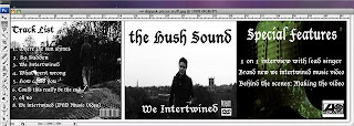
pic 1We wanted to keep the magazine cover similar but we wanted to entice potential buyers of the digi pack in, so we Incorporated lots of pictures from the video so readers could see the singer and band in action, we used bold writing so it stood out and put all relevant information on it e.g the bands web site and things like album of the year which Will also pull people in to buying the digi pack.
pic 2
2. How effective is the combination of your main product and ancillary texts?
Are group defiantly felt continuity was key as fans and possible future purchasers can see a consistent style in the artist work. The combination of our main product and ancillary texts has an effective combination because it created a relation to all three products. The main reason we decided to chose the shot we did for the main cover was to show clear distinction between the city and the lead singer, this is similar to our original idea of having the main singer with an instrument with a city in the background, we kept with the black and white on the cover and i think it really stands out and looks professional. we wanted to give a sneak preview of what the video actually has and its a similar style.The colour scheme we chose was black and white. The reason for this choice was because the song describes the main singer as upset and lonely there fore by using black and white it enhances the dullness and emotion in the shots. Seeing as we felt there was a slight rock feel within the song we thought we could show this with in the text chosen for the main cover. This allows the viewer to gain some idea of what the music genre is before listening to the song. The reason we set out our magazine ad and digipak as we did are because after studying possible ideas on the Internet we found using the simple yet effective ideas brings the message across clearly so viewers get a clear idea of what's going on. we didnt want to much on the front of the digi pack we just wanted to stick to an idea like the artic monkeys and show the main singer. On the magazine add we have various shots of exciting parts of the video, e.g the drum kit in the street whilst the main singer is walking past and the reflection shot in the window, these show the potential purchasers what they can expect in the digi Pack which is defiantly important in a magazine add as its main purpose is to entice potential product buyers. We have put the writing down the middle of the magazine add as we fell this is what readers will look at first then they can explore the different pictures going on and the writing saying things like must buy etc.
3. What have you learnt from your audience feedback?
I feel audience feedback is integral in perfecting a media peice, we recieved feeback halfway through filming/editing, this really helped us as a key thing that came up was that various parts went on for quite long and were quite bring, this constructive critism helped us as we corrected these parts, we made different quicker cuttin shots and made the pace faster to keep teh viewer intrested, another thing that came up was about certain shots being slightly unsteady and zooms being a bit shakey, with time i feel we could of either re done the shots or worked on final cut to help make these not as noticable, feedback is also extremely important as we as a group may not spot something wrong were others may pick up on it as well as getting opinions on wether the hole thing works. One good similarity that is effective is using the black and white technique throughout the main product and ancillary texts. Also the screen grabs and text used are all the same style therefore fit in with each other and show clear relations when you look at both pieces of work. all our products compliment each other well as similar styles have been used, we have used teh black and white style which is perhaps known as a theme to the fans of the group, it could be known as a bit of a trade mark. we had some feedback on the writing style we choose, it was said to be to gothic for the style of genre, but we feel it looks good and stands out and keeps with the black and white theme we have. Another thing that was feedback to our group was about the fact we have black and white for the shots of our main charater singing and colour for our instrument parts, this is constructive crisitism and we are pleased with it but we feel the purpose of the black and white was to show the emotion of the character being sad and alone, the black and white helps symbol his loneliness, and the instrument parts are meant to be more up beat and happier or we fealt viewers may think the hole video is to dull and depressing.
4.
pic 3
The use of media technologies was hugely helpful, the main things we used were final cut, photshop and the internet were we also used the blogger. All these things were key to the success of our 3 products. The blog was used to put research and information on, this was very helpful as we could upload videos and research and then analyse it on the blog, which helped us to understand music videos how they work and structure a plan for our video, we posted various ideas and could choose the best ideas and create one best idea, our regrets may be that we didnt put enough on the blog, even though we did more research etc than shown on the blog we didnt in some cases upload work which may have helped us improve out final peice and increase our mark, on the other hand a lot of work was produced and it was integral to our success. the internet was key also, using sites like youtube and google maps for research in to music videos and locations for filming. I also did some research on digi packs and magazine adds i did this from using information pictures and videos from the internet. we used final cut for the actual editing of the music video, this enabled us to cut out bits that were not needed and to put the order of footage in the right place fading bits of film in and adding techniques like tints and black and white, these were used to enhance the quality of our piece. photshop was used for the digi pack and magazine cover, we used paint, pen tool and the shape tool to help us create high quality products, there is a layers on photo shop so adding text and picures is easyt and simple and concentrating on each layer meant we could make each part as good as we could.
The use of media technologies was hugely helpful, the main things we used were final cut, photshop and the internet were we also used the blogger. All these things were key to the success of our 3 products. The blog was used to put research and information on, this was very helpful as we could upload videos and research and then analyse it on the blog, which helped us to understand music videos how they work and structure a plan for our video, we posted various ideas and could choose the best ideas and create one best idea, our regrets may be that we didnt put enough on the blog, even though we did more research etc than shown on the blog we didnt in some cases upload work which may have helped us improve out final peice and increase our mark, on the other hand a lot of work was produced and it was integral to our success. the internet was key also, using sites like youtube and google maps for research in to music videos and locations for filming. I also did some research on digi packs and magazine adds i did this from using information pictures and videos from the internet. we used final cut for the actual editing of the music video, this enabled us to cut out bits that were not needed and to put the order of footage in the right place fading bits of film in and adding techniques like tints and black and white, these were used to enhance the quality of our piece. photshop was used for the digi pack and magazine cover, we used paint, pen tool and the shape tool to help us create high quality products, there is a layers on photo shop so adding text and picures is easyt and simple and concentrating on each layer meant we could make each part as good as we could.
1622 words
Group Script
Group Script (Written as a conversation).
In what ways does your media product use, develop or challenge forms and conventions of real media products?
Our media product has followed conventions of real media products such as with in our music video it has incorporated sections of performance. This is shown in the video from the main singer sections and from the band sections. We only showed them performing individually because it made the main singer come across as more lonely. We could of done some group performance if we had of had more time. If we chose to use group performance we would of showed the band without the lead singer. This again would have enhanced the main singers solitude in the video. Certain videos influenced us for shots within our video piece. One video was ‘thousand miles’ by Vanessa Carlton, which inspired us for the close up on the piano shots, as well as following the main singer throughout the video.
How effective is the combination of your main product and ancillary texts?
The combination of our main product and ancillary texts has an effective combination because it created a relation to all three products. The reason we chose the shot we did for the main cover was to show clear distinction between the city and the lead singer. This was to show off the main characteristics of the video in one shot. The colour scheme we chose was black and white. The reason for this choice was because the song describes the main singer as upset and lonely there fore by using black and white it enhances the dullness and emotion in the shots. Seeing as we felt there was a slight rock feel within the song we thought we could show this with in the text chosen for the main cover. This allows the viewer to gain some idea of what the music genre is before listening to the song. The reason we set out our magazine ad and digipak as we did are because after studying possible ideas on the Internet we found using the simple yet effective ideas brings the message across clearly so viewers get a clear idea of what's going on.
What have you learnt from your audience feedback?
After receiving feedback half way through the creation of our main product one change we made to our main product was shortening certain clips. We especially did this towards the end of the video to fasten the general pace. If we were given more time for our media product we would of corrected some shots to create a smoother effect. This could be improved in shots such as when the camera slightly jolts in zooms. The feedback we have received has been important because by getting the audiences views it allows us to know what they want and constantly correct what we can to improve our final piece. Our products compliment each other because of the similarities in all the work. One good similarity that is effective is using the black and white technique throughout the main product and ancillary texts. Also the screen grabs and text used are all the same style therefore fit in with each other and show clear relations when you look at both pieces of work.
How did you use new media technology in the construction, research, planning and evaluation stages?
Media technology with in our main product allowed us to research, plan, evaluate and construct our media piece easily. One way this was achieved was from the use of Internet, which allowed us to study music videos easily as well as allow us to post and review them on the blog. Also we used final cut and Photoshop. These allowed us to construct the main product in a professional manner as well as edit and cut shots to make the video flow with the music. The availability of the programmes used is quite high seeing as you can download Photoshop and final cut off any computer provided you have the use of the Internet. This means anybody has the means to make the music video. After seeing our final products the use of the programmes seemed to of gone fairly well. We managed to edit our video with a lot of different styles and techniques, which turned out to have quite an effective result therefore the use of final cut, seemed to be positive. Also the use of Photoshop for our magazine ad and digipak turned out looking professional and believable, as a front cover therefore also seemed to have a positive outcome. If we were to improve on one use of the programmes we used it would be the blog due to the fact that we could of added more research such as pictures and other media relations which could of improved our knowledge and understanding of music videos on the whole.
Thursday, 3 December 2009
Commentary Filming plan
Shot types
- Close ups
- Front on
Background
- Plain room
- Field
- City
- Bright colour
Commentary style
- Interview
- Conversation
- Dictation
I think we will be using both the shot types to keep the pace of the commentary moving, we will most likely be filming in a room rather than outdoors, i think it should be a black background behind us with lighting on us. We will comment on our products through a conversation, talking about how we think things went and what we could have done, and the effect what we did do had on the audience.
Points for Group commentary
In what ways does your media media product use, develop or challenge forms and conventions of real media products?
- Does it follow conventions?
- Why lots of individual performance?
- Should we have done some group performance?
- Were we inspired by any videos? similar to any videos?
- Shot types used? why?
How effective is the combination of your main product and ancillary texts?
- Why did we choose the shots we did?
- Why did we choose the colour scheme we did?
- Why that text?
- Why that layout?
What have you learnt from your audience feedback?
- Changes we've made to our products because of feedback we have received
- Changes we would make to our products if we were given more time? why?
- Importance of the feedback we have received?
- Why do all our products compliment each other?
How did you use new media technology in the construction, research, planning and evaluation stages?
- What did this technology allow us to do?
- Why this was important for us?
- How available are these products?
- How well did we use all these different programmes? well? poorly?
Tuesday, 1 December 2009
feedback
We feel that the continuity of the Digi Pack works really well, also the pictures work well with the genre and style of the music video. The bad side to this is we feel the text does not suit the genre as well as the style can look a bit to gothic for the style of song.
Feedback
Digipack
Good choice of pictures, especially for the front (the skyline shot, which looks professional).
Most of it looks professional, the special features page looks slightly out of place.
Advert
The type font works well with the range of pictures. It matches the video rather well, mainly due to the use of screenshots.Publish Post

